
『美しさで人生を豊かに。』という信念のもと、発売を延期してまで開発を重ね、とことんこだわった、国産 生リポソームビタミンCをはじめとする、女性の総合美容に挑戦し続ける
『Mirror Rich』のブランド立ち上げにお力添えさせていただきました。
ターゲットである美容にストイックな女性の持つ課題の抽出、フィロソフィーを体現するロゴの開発計画、パッケージ、キービジュアルやLPの制作、開発、お客さまへのオンボーディングレター...
立ち上がりのあらゆるタッチポイントにおいて、フィロソフィーの体現とお客様へのふれあい方を総合的にサポートさせていただきました。
“Mirror Rich” has the philosophy of “Enrich your life with beauty” and they provide “the raw liposome jerry” which includes vitamin C above 1,000mg. They are trying to support female general beauty treatment. We supported the brand launch in order to express their philosophy.
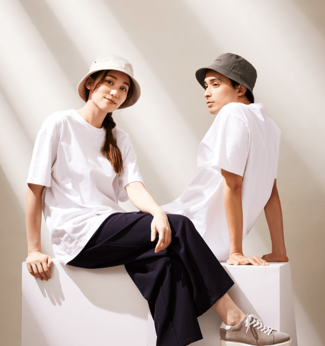
We created each touch points’ items such as developing their logo, package, key visuals and onboarding letter. “Stoic” is the key word and creative key concept for them because both their supposed target and themselves have the stoic attitude for keeping their beauty and health.
上述の通り”Stoic”をキーコンセプトに、全てのクリエイティブを構築。
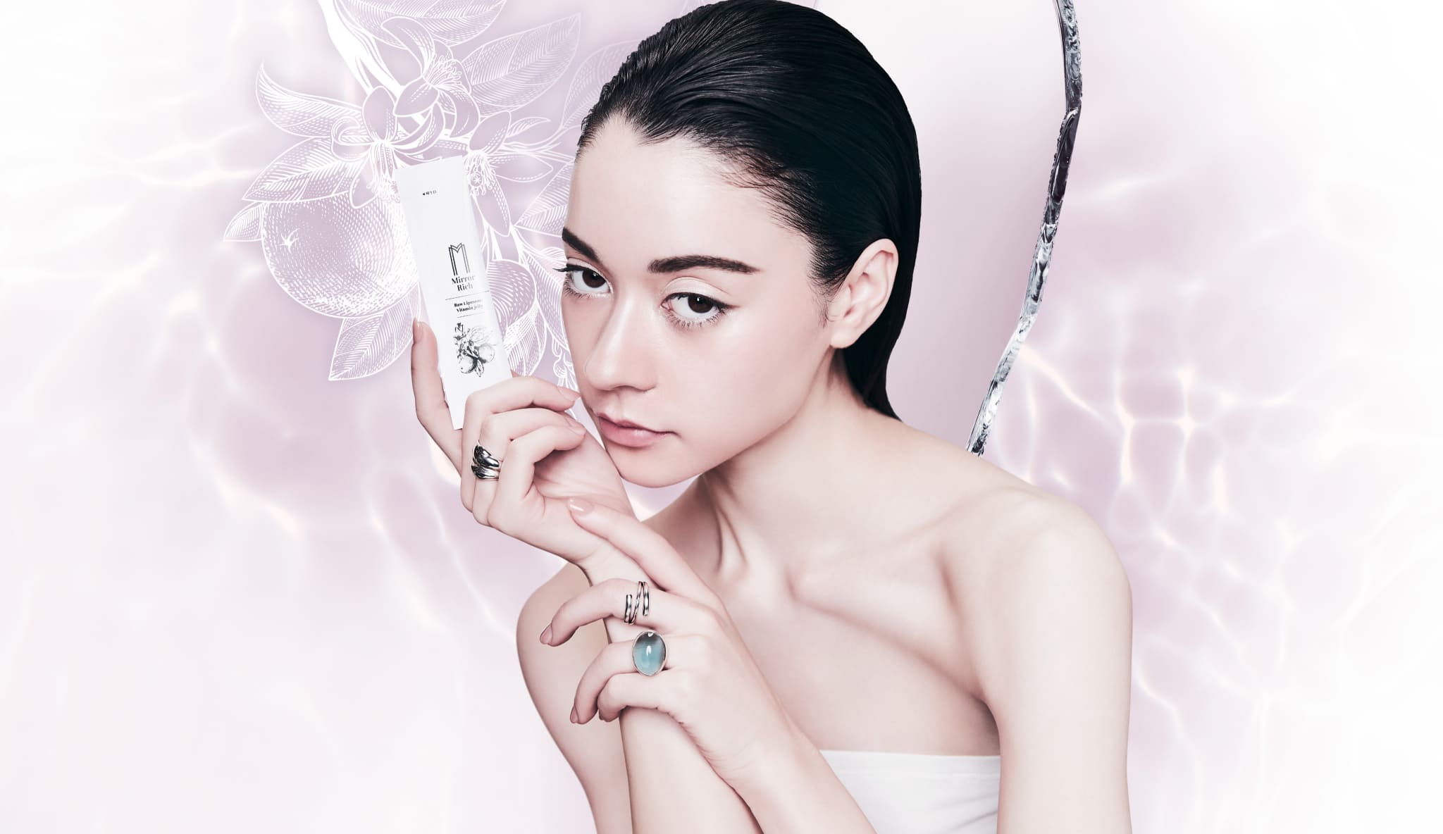
プロダクトのキービジュアルは”Mirror”から連想される『反射』も取り入れた創りにしました。
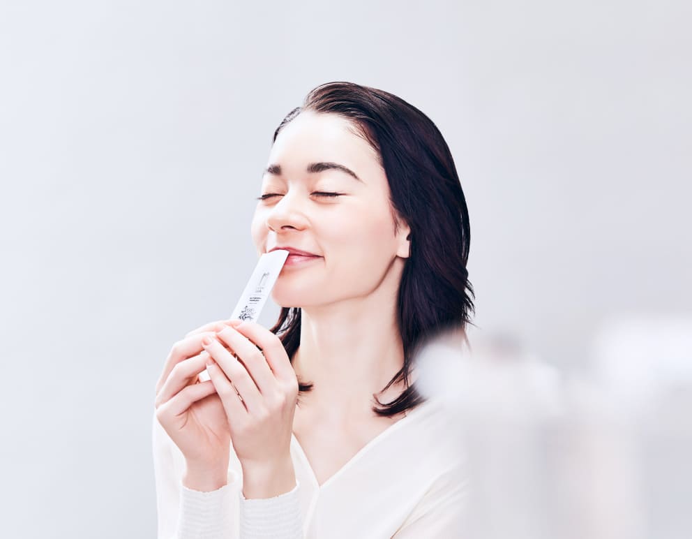
Mirror Richの生リポソームゼリーの特徴は『美味しい』仕上がりとなっていること。今まで美容のために我慢しながら生リポソーム製品を摂っていたカスタマーにとって、
非常に画期的な製品に仕上がっています。そのため、美味しさと美しさを表現する事が求められました。
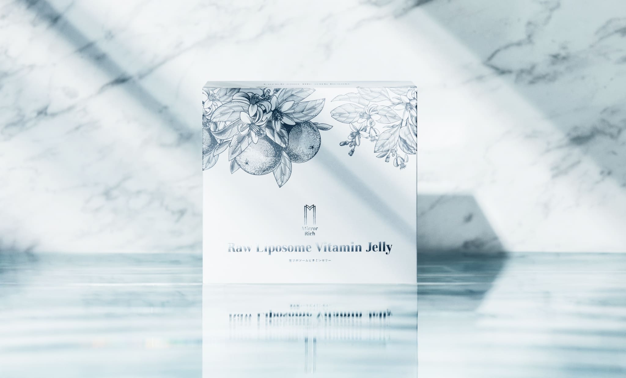
パッケージにはベルベットPPおよび活版を用いて、高級感とストイックさを表現。無駄なものを入れず、白ベースでどこまで瑞々しさと美味しさを表現できるかを追求したパッケージに仕上げました。
Every creative is developed based on the concept of “Stoic”.
In particular, the product key visuals include the secondly concept of “reflection” which is originated by the word of “Mirror”.
The characteristic of the raw liposome jerry is “tasty.” When it comes to the past, customers end up having a bad product which has too much bitter taste.
Therefore, MirrorRich’s tasty raw liposome jerry is really cutting-edged in the beauty industry. Thus, illustrating both beauty and taste is a requirement in each item.
We decided to use the velvet PP and metal type printing in order to express both a stoic and rich atmosphere.
There are no wasted things, and we pursue how to express both beauty and fresh image in the package.


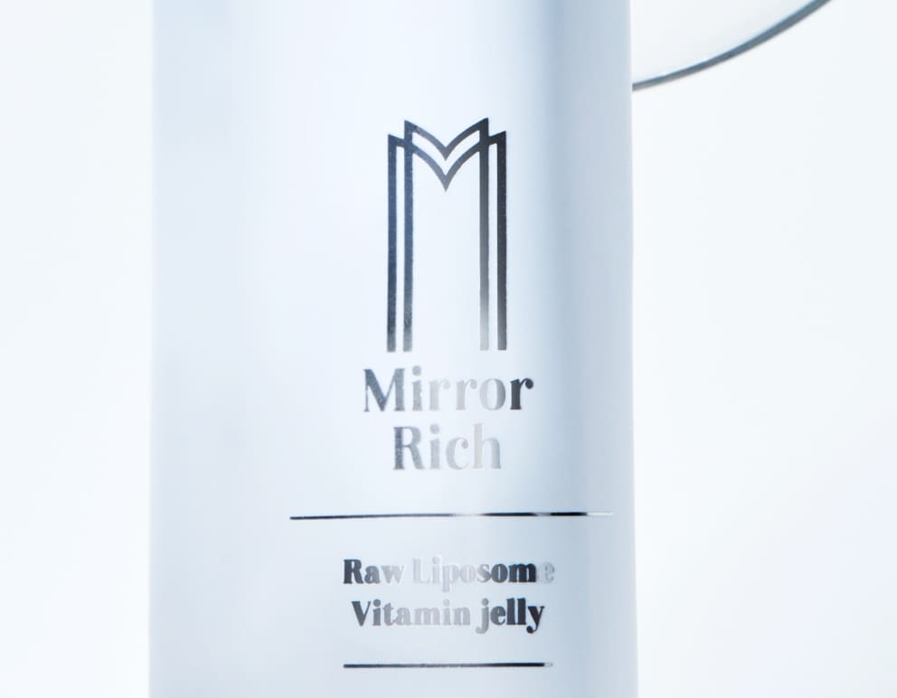
「美の入口」を象徴し、頭文字のMと扉を掛け合わせたロゴマークを開発。
大きな余白と縦に伸びているプロポーションはブランドが大きく成長していきますように、という願いを込めました。
The logomark symbolizes “the beauty gate”, and the proportion is multiplied by their initial “M” and door. We have incorporated the wish for our brand's significant growth into the design, with spacious margins and a vertically elongated proportion.


Contact us via mail-form or
follow us on Instagram.
ご質問、お問い合わせはこちらから。私たちはあなたからの連絡をお待ちしています!